Typographic Calendar
Product Design Concept
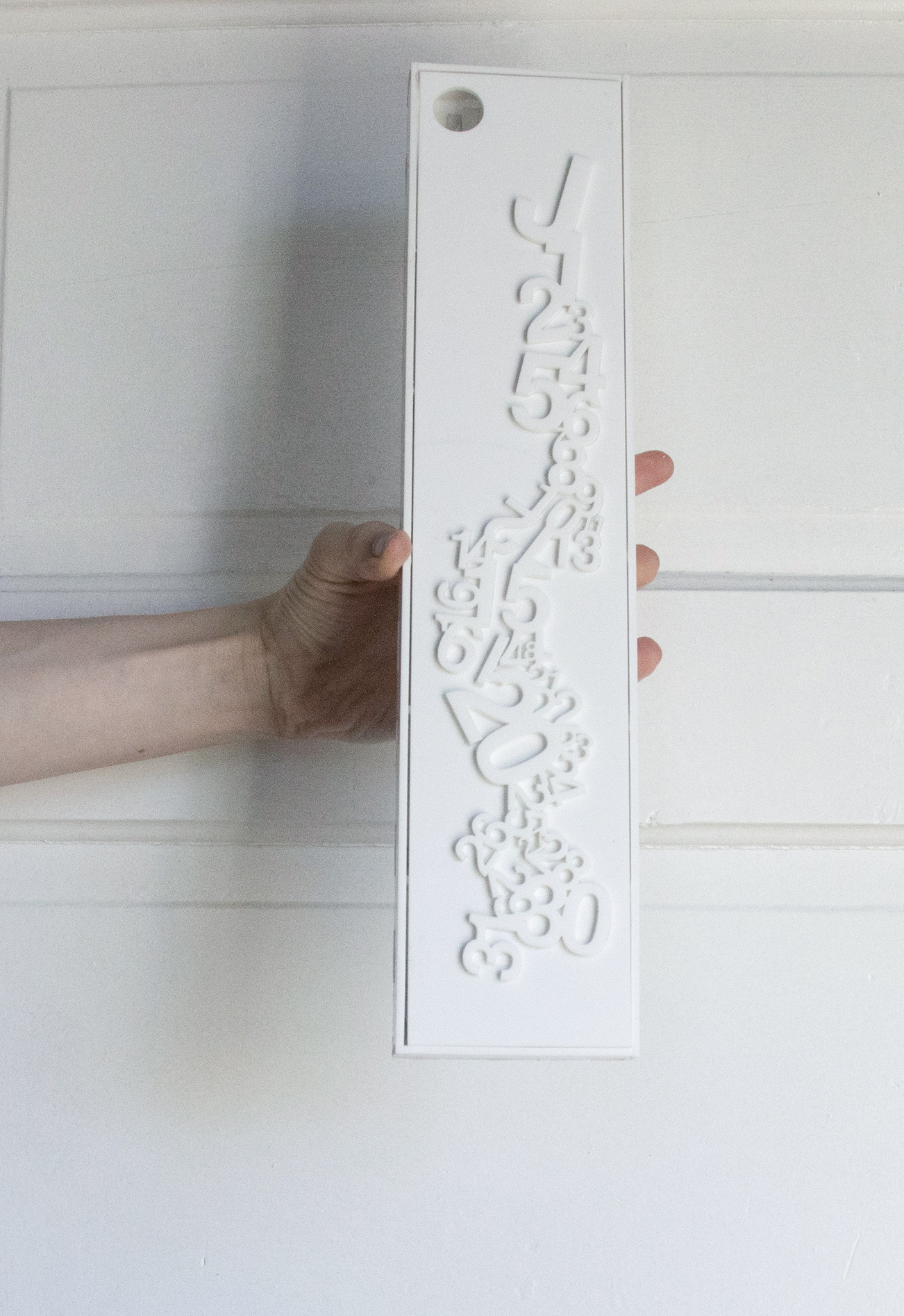
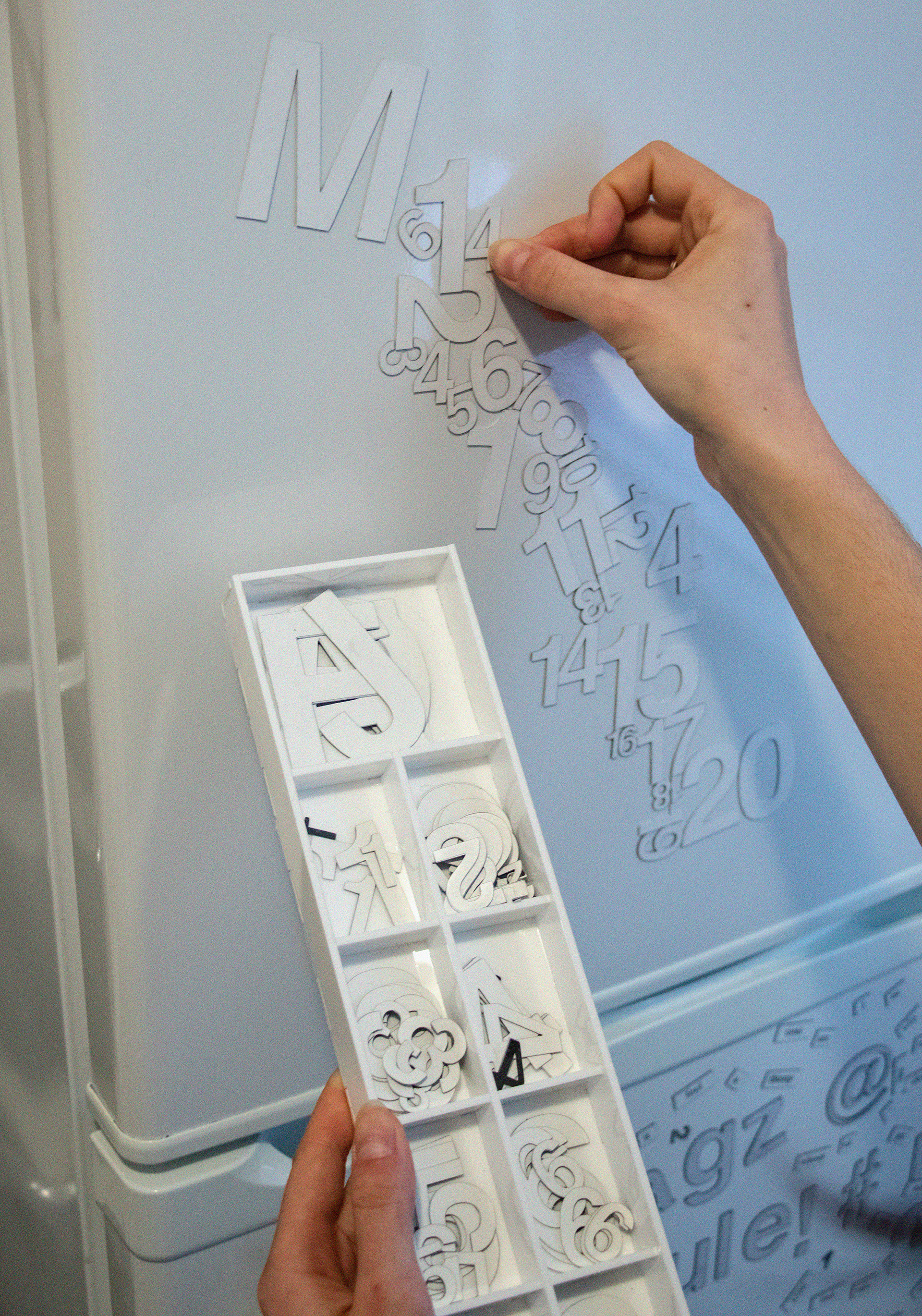
This piece was a capstone project for a typography course in the Seattle University design program. The prompt was open-ended: conceptualize and produce a calendar that could be sold as a product.
I wanted to create something entirely dissimilar from traditional wall calendars, daily tear-off booklets, and weekly planners. This deconstructed design takes inspiration from the playfulness of magnetic refrigerator poetry. Like the absurd but sometimes meaningful refrigerator prose, I hoped the user might create their own monthly compositions; re-imagining the rigid function of a calendar into something less useful, a little more absurd, but no less meaningful.
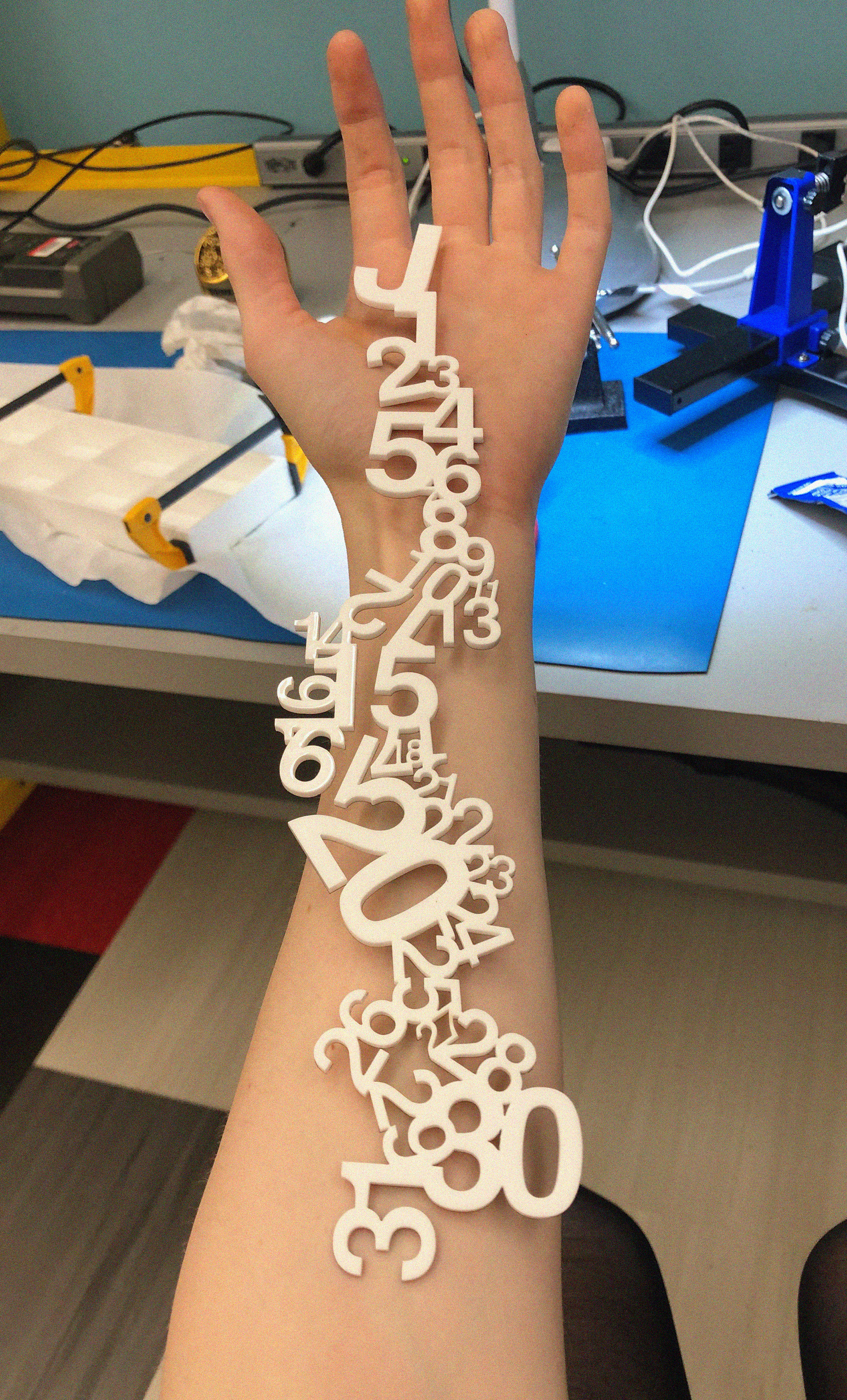

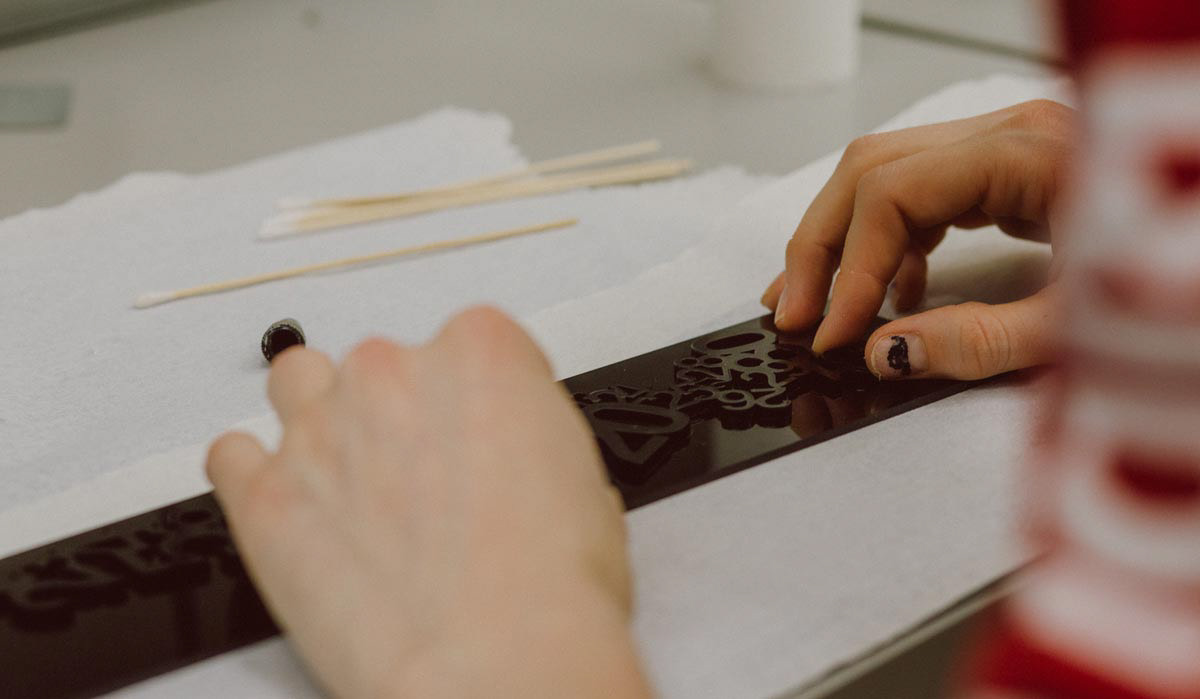
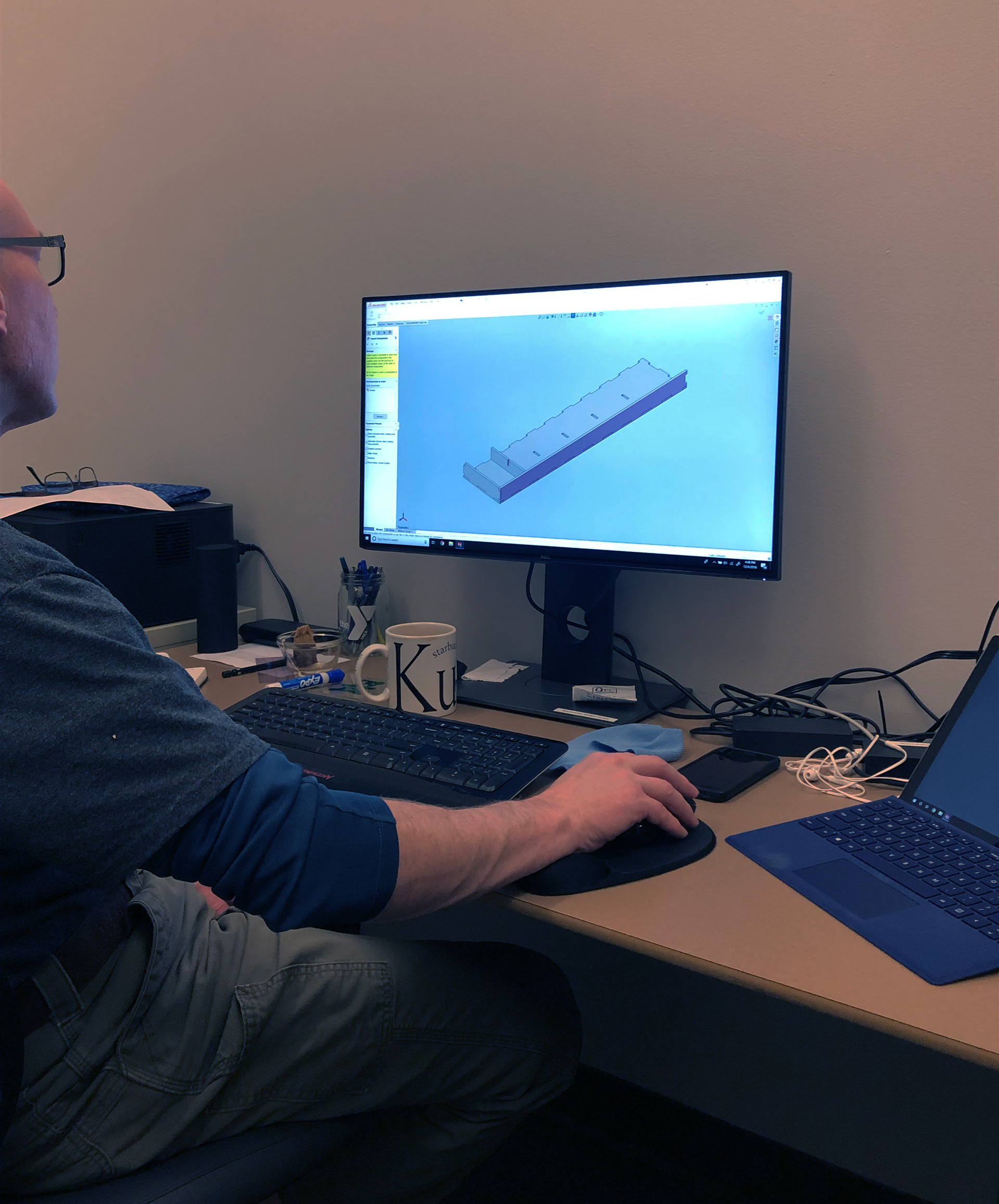
I collaborated with the fabrication lab and engineering staff at SU to produce my design—a custom acrylic box with compartments to hold dozens of letters and numbers cut from magnetic sheets.
The final product (which comes in white, black, and transparent acrylic options) connects the user with typography through touch and play, and to transform a familiar appliance into a canvas for expressive typographic compositions.

Original design (white Calendar) created in 2018. Additional colors were fabricated in 2020 for the Seattle University 2020 Senior Design Exhibition.